Image: ice cream cup by Nicole Yip from the Noun Project
Get the taste of HTML and CSS: structure and style your web pages
 Welcome!
Thanks for giving me the opportunity to help you with getting the taste of HTML and CSS.
HTML Introduction
HTML stands for HyperText Markup Language and also known as the language for Web. It is responsible for the structuring of web page in the web browsers.
CSS Introduction
CSS stands for Cascading Style Sheets. It describes how HTML elements should be displayed and responsible for styling of our web pages.
Who is this tutorial for
This tutorial is for anyone who wants to know what HTML and CSS does and have an interest in building Website or Web application.
Prerequisites
- Enthusiasm to learn HTML/CSS
- Interest in Web Development
- Working Computer or Laptop
- Nice Code Editor (VS Code recommended)
- Academic level HTML/CSS knowledge (Bonus)
What we are going to build
We will build a simple Student Portfolio website in this tutorial. A student portfolio website acts as a way to introduce a student to anyone in the internet and help showcase his or her skills.
We will cover following things in our website:
- A nice introduction
- Personal and Academic information
- Blogs
| You can consider it as a Developer Portfolio website if you working as an engineer. |
Click here to preview the website.
| The website might look ugly in mobile as it is beyond the scope of this tutorial. |
This tutorial has been designed to be fully hands-on.
| You can find all the resources related to this tutorial including source code under Resources section. However, I recommend you to follow the tutorial step by step to get maximum benefit. |
Tutorial Workflow
The tutorial has been designed to be followed first and understand later format unlike traditional ones where we mostly learn about theory part first and then later practical.
Workflow of tutorial is quite simple as:
- Whole tutorial is divided into different steps with a goal in each step.
- There is a starter step which briefly explain how to setup starter code.
- Each step has instructions along with code snippets to be followed to achieve the goal.
- The important concept will be briefly explained during each step.
| If you find difficulty in understanding any concepts, please comment or provide feedback at the bottom of the tutorial. I will try to update accordingly. |
Step 0 : Starter
Code setup
Using Git and GitHub (Recommended)
- Make a project structure:
mkdir projects && cd projects[Optional] git clone https://github.com/brgtrainings/student-portfoliocd student-portfolio- Go to
starterbranch:git checkout starter - Open
student-portfoliofolder in your favorite editor. - Open
index.htmlfile in the browser.
Using Zip
- Click to download the Starter Zip.
- Unzip
student-portfolio-starter.zip. - Open
student-portfolio-starterfolder in your favorite editor. - Open
index.htmlfile in the browser.
Preview
You should be able to see the following:
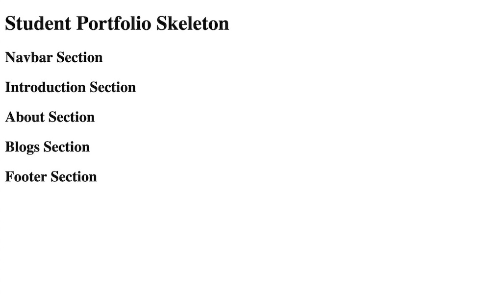
Code overview
When you open the index.html file in editor, you will find following:
-
<!DOCTYPE html>: A HTML 5 declaration which gives an information to the browser about what document type to expect.NOTE: HTML 4 had older format
<!DOCTYPE HTML PUBLIC \"-//W3C//DTD HTML 4.01 Transitional//EN\" \"http://www.w3.org/TR/html4/loose.dtd\">. -
<link rel="stylesheet" href="css/style.css" />: Link the CSS file in the document. -
<link rel="shortcut icon" href="img/favicon.ico" type="image/x-icon" />: Link the favicon image to be displayed next to the URL of your site in a browser’s address bar. -
<meta charset="UTF-8">: Specify the character encoding for the HTML document. -
<meta name="viewport" content="width=device-width, initial-scale=1.0">: Instructs the browser to sets the width of the page to follow the screen-width of the device.
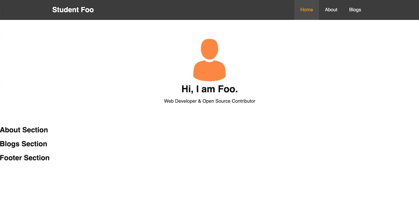
Step 1 : Navigation Bar
In this step we will build the navigation bar of our website.
Navbar code snippet
Update the nav tag as follows:
<nav id="navbar">
  <div class="container">
    <h1 class="logo"><a href="#home">Student Foo</a></h1>
    <ul>
      <li><a href="#home" class="active">Home</a></li>
      <li><a href="#about">About</a></li>
      <li><a href="#blogs">Blogs</a></li>
    </ul>
  </div>
</nav>
NOTE: Remove the <h1>Student Portfolio Skeleton</h1> and <h2>Navbar Section</h2> lines.
Add following in the css/style.css.
/* Resets */
* {
  margin: 0;
  padding: 0;
  box-sizing: border-box;
}

/* Util Classes */
.container {
  margin: auto;
  max-width: 1100px;
  padding: 0 20px;
}

/* Main CSS */
html, body {
  font-family: Helvetica, Arial, sans-serif;
  line-height: 1.7rem;
}

a {
  text-decoration: none;
  color: #444;
}

h1, h2, h3 {
  padding-bottom: 20px;
}

p {
  margin: 10px 0;
}

/* Navbar */
nav {
  background: #444;
  color: #fff;
  overflow: auto;
}
nav a {
  color: #fff;
}
nav h1 {
  float: left;
  padding-top: 20px;
}
nav ul {
  float: right;
  list-style: none;
}
nav ul li {
  float: left;
}
nav ul li a {
  display: block;
  padding: 20px;
  text-align: center;
}

nav ul li a:hover, nav ul li a.active {
  background: #555;
  color: orange;
}
I hope that the above code is simple enough to understand. If you are finding difficulty to understand any of HTML element or CSS please check the Resources section for HTML and CSS references.
NOTE: Check the above step’s commit in GitHub.
Navbar Preview
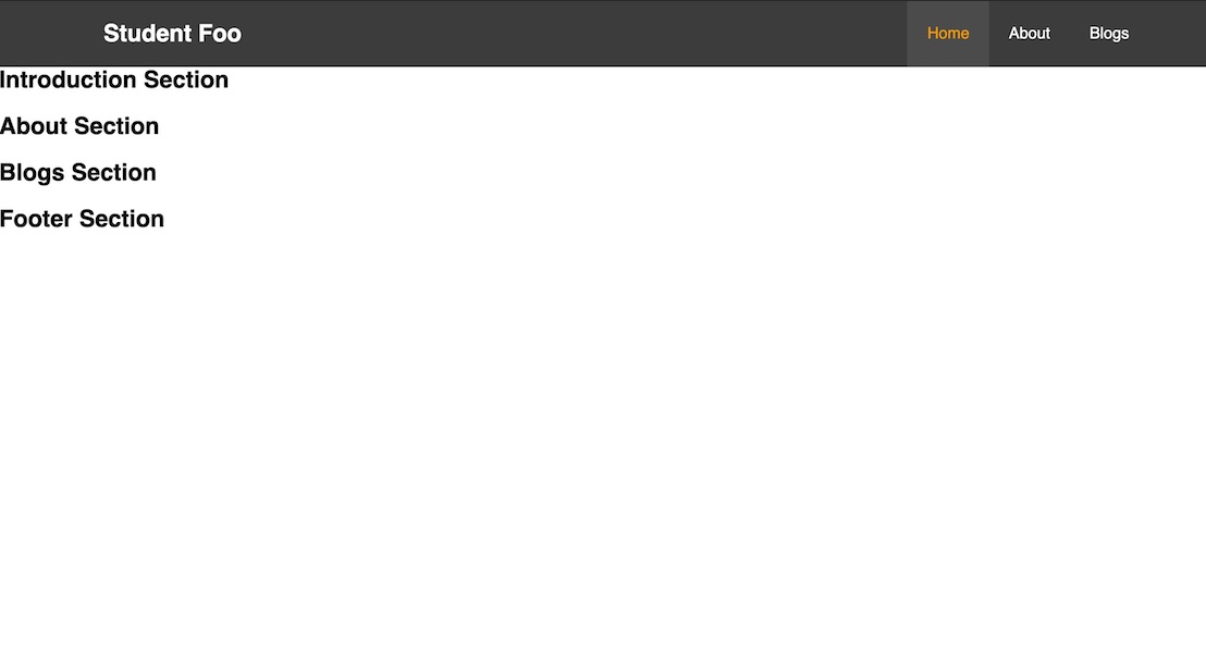
NOTE: In the above step, HTML elements like nav, h1, h2, a are instructing browser to show different web page elements like heading, links etc. Also, navbar and home menu items color are different and achieved through CSS.
Step 2: Introduction Section
In this step, we will add a basic introduction of student like name and it’s basic role.
Intro code snippet
Replace the <h2>Introduction Section</h2> with following:
<div id="intro" class="section-padding">
  <div class="container">
    <div class="profile">
      <img src="img/profile.png" alt="Profile Image">
    </div>
    <div class="intro-body">
      <h1>Hi, I am Foo.</h1>
      <p>
        Web Developer & Open Source Contributor
      </p>
    </div>
  </div>
</div>
IMAGE: Download the profile.png image from here
 .
.
And, update css/style.css with following CSS for introduction.
/* Introduction */
#intro .profile, #intro .intro-body {
  text-align: center;
}
#intro .profile img {
  height: 150px;
  width: auto;
}
#intro .intro-body h1 {
  padding-bottom: 5px;
}

/* paste under Util classes */
.section-padding {
  padding: 60px 0;
}
Intro Preview
NOTE: Check the above step’s commit in GitHub.
Step 3: Adding Icon library [Bonus]
Icons are small image that represents a concept or specific entity with meaning to the user. We will be including a popular icon library known as Font Awesome in this step.
Add following link tag in the head section.
<link rel="stylesheet" href="https://cdnjs.cloudflare.com/ajax/libs/font-awesome/5.14.0/css/all.min.css" />
| One can get CSS or JS files of many popular libraries or framework from https://cdnjs.com/. |
After adding above library, you can have icon in your web page with simple i tag like
<i class="fas fa-home"></i>

<!-- 2x Size -->
<i class="fas fa-home fa-2x"></i>
will give icon as and respectively.
You can get list of all icons here.
NOTE: You can resize the icon using simple classes like fa-sm, fa-lg, fa-2x etc. See the sizing options.
Step 4: About Section
In this step, we will be adding about section which will display student academic details and skills.
About layout
It will be a two column layout where in the left column we will show some intro and skills and on the right column we will show educational details.
The about section code layout will be:
<section id="about" class="section-padding">
  <div class="container">
    <header>
      <h1 class="text-center">About Me</h1>
    </header>
    <div class="about-content">
      <div class="column1">
        <div class="intro-text">
          <!-- code -->
        </div>
        <div class="skills">
          <!-- skill code -->
        </div>
      </div>
      <div class="column2">
        <!-- column two code -->
      </div>
    </div>
  </div>
</section>
And CSS is:
#about {
  background-color: #eee;
  overflow: auto;
}
#about header h1 {
  font-size: 2rem;
}
#about .about-content > div {
  width: 50%;
  overflow: auto;
  padding: 0 2rem;
}
About left column
Let’s add introduction and skills in the left column. Update div with column1 class as:
<div class="column1">
  <div class="intro-text">
    <p>
      Hi, my name is Foo. I am a 4th Year Computer Science student and have dream of helping world by
      making better softwares.
    </p>
    <p>
      Web Development excites me a lot and like to play with its related technologies whenever I get time.
    </p>
  </div>
  <div class="skills">
    <h3>Skills <i class="fas fa-cogs fa-lg"></i></i></h3>
    <div class="skills-grid">
      <div class="skill-item width_80">HTML (80%)</div>
      <div class="skill-item width_70">CSS (70%)</div>
      <div class="skill-item width_60">JavaScript (60%)</div>
    </div>
  </div>
</div>
And CSS as:
/* About left column */
#about .about-content .column1 {
  float: left;
}
#about .about-content p {
  margin-top: 0;
}
#about .about-content .skills {
  margin-top: 20px;
}
#about .about-content .skills .skill-item {
  background-color: orange;
  height: 25px;
  margin-bottom: 5px;
  padding-left: 10px;
  font-size: 13px;
}

/* Paste under Utility classes */
.text-center {
  text-align: center;
}
.width_80 {
  width: 80%;
}
.width_70 {
  width: 70%;
}
.width_60 {
  width: 60%;
}
You should be able to see following:
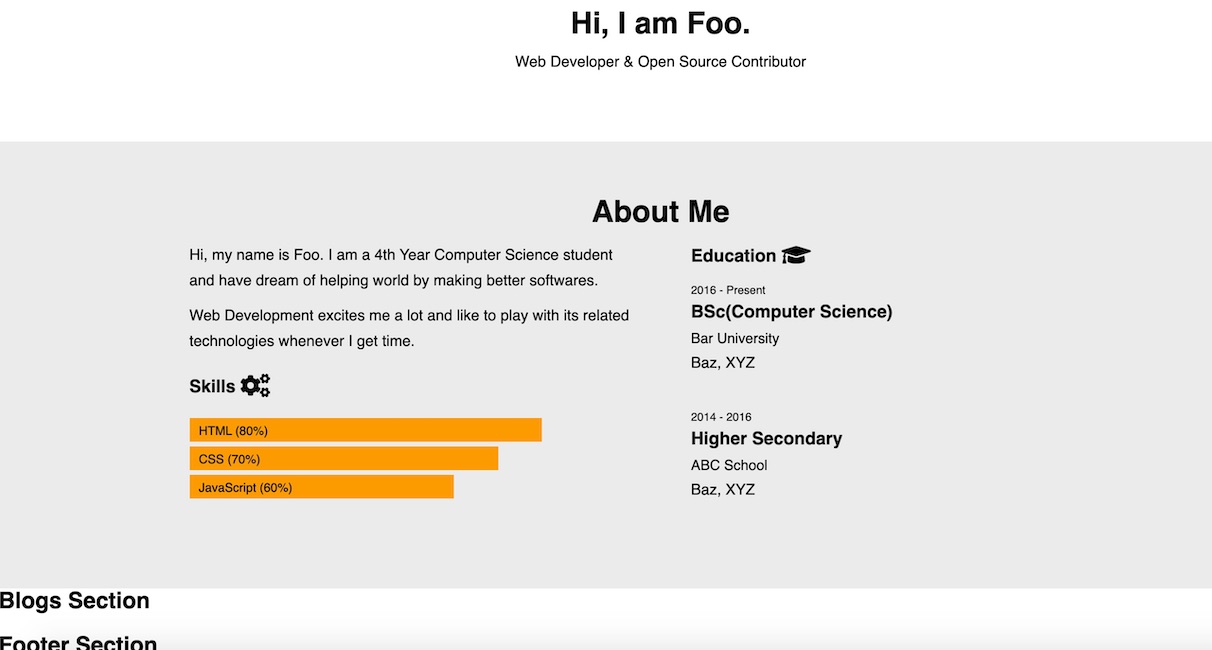
About right column
Now, let’s update the right column with educational details. Update div with class column2 as:
<div class="column2">
  <h3>Education <i class="fas fa-graduation-cap fa-lg"></i></h3>
  <div class="education-grid">
    <div class="education-item">
      <p class="year">2016 - Present</p>
      <h3>BSc(Computer Science)</h3>
      <h4>Bar University</h4>
      <p>Baz, XYZ</p>
    </div>
    <div class="education-item">
      <p class="year">2014 - 2016</p>
      <h3>Higher Secondary</h3>
      <h4>ABC School</h4>
      <p>Baz, XYZ</p>
    </div>
  </div>
</div>
And CSS as:
/* About right column */
#about .about-content .column2 {
  float: right;
}
#about .about-content .column2 h3 {
  padding-bottom: 10px;
}
#about .about-content .education-grid .education-item {
  margin-bottom: 30px;
}
#about .about-content .education-grid .education-item .year {
  font-size: 12px;
  font-weight: 500;
  margin-bottom: 0;
}
#about .about-content .education-grid .education-item h3 {
  padding: 0;
  margin-bottom: 5px;
  line-height: 1;
  font-weight: 700;
}
#about .about-content .education-grid .education-item h4 {
  font-size: 15px;
  font-weight: 500;
}
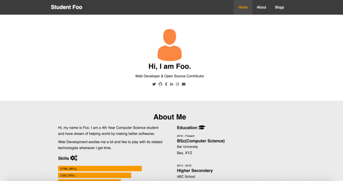
Now, about section should be updated as following:
NOTE: Check the above step’s commit in GitHub.
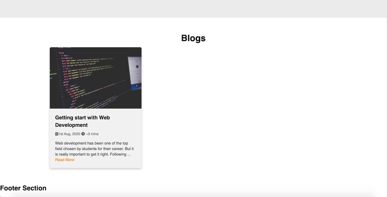
Step 5: Blogs Section
In this step, we will add blogs to the page.
We will use very simple layout for listing our blogs. It will be a three column layout with one blog item per column.
Blog layout
The skeleton of three column layout for listing blogs is:
<section id="blogs" class="section-padding">
  <div class="container">
    <header>
      <h1 class="text-center">Blogs</h1>
    </header>
    <div class="blogs-content">
      <div class="column">
        <!-- 1st Blog content -->
      </div>
      <div class="column">
        <!-- 2nd Blog content -->
      </div>
      <div class="column">
        <!-- 3rd Blog content -->
      </div>
    </div>
</section>
And CSS for above layout is:
#blogs header h1 {
  font-size: 2rem;
}
#blogs .column {
  float: left;
  width: 33.3%;
  padding: 0 10px;
}
#blogs .blogs-content:after {
  content: "";
  display: table;
  clear: both;
}
Blog item layout
In this part, we will add the first blog item and it’s required CSS. We will repeat the same for other two blog items.
Add the following content in the first div with column class having comment 1st Blog content.
<div class="card">
  <img src="img/website.jpg" alt="Web Development">
  <div class="blog-body">
    <h3 class="blog-title">Getting start with Web Development</h3>
    <div class="meta">
      <span><i class="fas fa-calendar-alt"></i>1st Aug, 2020</span>
      <span><i class="fas fa-clock"></i> ~3 mins</span>
    </div>
    <p class="blog-text">
      Web development has been one of the top field chosen by students for their career.
      But it is really important to get it right.
      <a href="#">Read More</a>
    </p>
  </div>
</div>
And, add its CSS as:
#blogs .blogs-content .card {
  box-shadow: 0 4px 8px 0 rgba(0, 0, 0, 0.2);
  background-color: #f3f3f3;
  border-radius: 5px;
}
#blogs .blogs-content .card img {
  width: 100%;
  border-radius: 5px 5px 0 0;
}
#blogs .blogs-content .card .blog-body {
  padding: 10px 20px;
}
#blogs .blogs-content .card .blog-body .blog-title {
  padding-bottom: 5px;
}
#blogs .blogs-content .card .blog-body .meta {
  font-size: 13px;
  color: #666;
}
#blogs .blogs-content .card .blog-body .blog-text {
  font-size: 14px;
  color: #444;
  line-height: 20px;
}
#blogs .blogs-content .card .blog-body .blog-text a {
  color: darkorange;
}
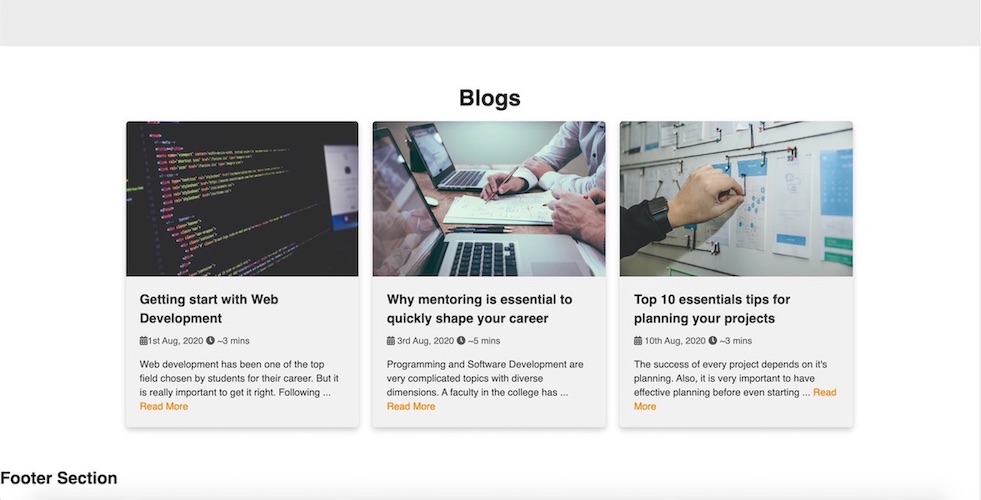
You should be able to see the first blog item as:
Other blog items
Now, repeat the HTML content with different blog content for other two blogs. CSS need not to be changed.
The final blogs section should look like as below:
| All the images for this tutorial have been taken from from https://unsplash.com/. |
Step 6: Footer
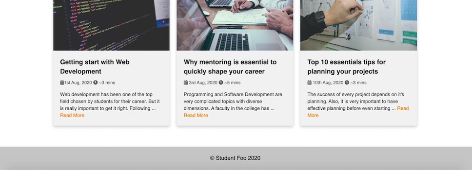
One last thing remaining is footer which is the bottom most part of website and usually contains links to other pages, contact links, copyright and other credits.
We will add a simple copyright content in our footer.
Add the following HTML code:
<footer>
<div class="text-center">© Student Foo 2020</div>
</footer>
And CSS as:
footer {
  background: #ccc;
  padding: 20px;
}
The footer will look like:
| The website we have created will not be responsive i.e it might look ugly in mobile or other devices. You can achieve that through the help of 'media queries'. |
Step 7: Adding Social contacts [Bonus]
In this step, we will add a list of social contacts of student. The best place is at the introduction section below the role.
Add the following social links inside the div with intro-body class whose parent div id is intro.
<div class="social-links text-center">
  <a href="#" alt="Twitter">
    <i class="fab fa-twitter"></i>
  </a>
  <a href="#" alt="GitHub">
    <i class="fab fa-github"></i>
  </a>
  <a href="#" alt="Facebook">
    <i class="fab fa-facebook-f"></i>
  </a>
  <a href="#" alt="LinkdIn">
    <i class="fab fa-linkedin-in"></i>
  </a>
  <a href="#" alt="Instagram">
    <i class="fab fa-instagram"></i>
  </a>
  <a href="#" alt="Email">
    <i class="fas fa-envelope"></i>
  </a>
</div>
And, its CSS will be:
#intro .social-links a {
  margin-right: 0.5rem;
}
NOTE: I will leave up to you to add the different color for the different social icons.
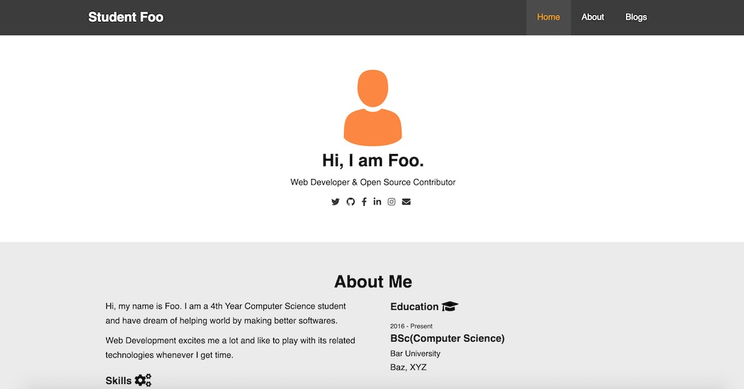
The introduction section should be updated as following:
Resources
Where to go from here
You can go through following useful links to continue your journey with HTML and CSS learning.
- w3schools HTML Tutorial - Reference tutorial
- Mozilla HTML Tutorial - Reference tutorial
- w3schools CSS Tutorial - Reference tutorial
- Mozilla CSS Tutorial - Reference tutorial
- htmlreferences.io - Nice guide on HTML elements and its attributes
- cssreference.io - A visual guide to CSS
Wishing you good luck for the learning journey ahead.
Thank You!

Help me to improve this tutorial.