Calculator - UI and functional changes
Calculator - UI and functional changes
In this tutorial, we are going extend the calculator that we built in previous part.
We will mostly do the UI improvement as the functionality of operations is complete.
| Source code details included at the bottom of this page. |
Demo
See the Pen Calculator in HTML/CSS/JS Part 2 by Cool BRG (@coolbrg) on CodePen.
Update of CSS
Remove unnecessary class
We can remove the CSS class center from table tag by adding margin: auto; to table itself in style.css.
Update following CSS snippets from style.css:
/* Remove following */
table.center {
  margin-left: auto;
  margin-right: auto;
}

/* Update table as below */
table {
  margin: auto;
  border-collapse: collapse;
  border-radius: 5px;
}
And, remove class="center" from table tag in index.html file.
Now, if you open index.html file in browser, you should see no difference in alignment of calculator.
Right align result
Right now the text alignment for texbox is left which is default. Let’s update to make it to right side which looks natural.
input[type="text"] {
  ...
  border-radius: 5px;
  text-align: right;
}
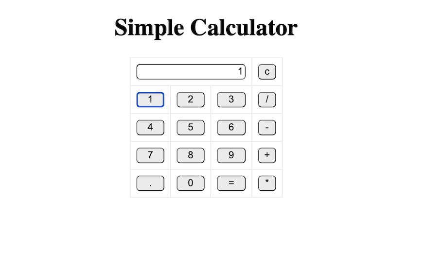
Remove blue ring around buttons
Click on any button and you will notice a blue ring around it. See below:
Add following CSS to remove it:
input[type="button"] {
...
}
input[type="button"]:focus {
 outline: 0;
}
Now, if you click on any button, blue ring won’t appear.
Calculator UI changes
In this section, we will try to modify the UI of the calculator.
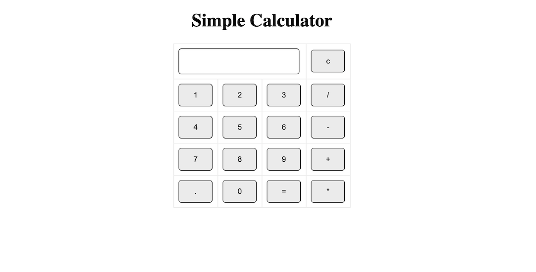
Udpate width of buttons and textbox
Right now the height and width of calcultor buttons and textbox are quite small. Update them as below:
input[type="button"] {
  ...
  border-radius: 5px;
  width: 60px;
  height: 40px;
}

input[type="text"] {
  ...
  text-align: right;
  height: 40px;
}
Result should look like below:
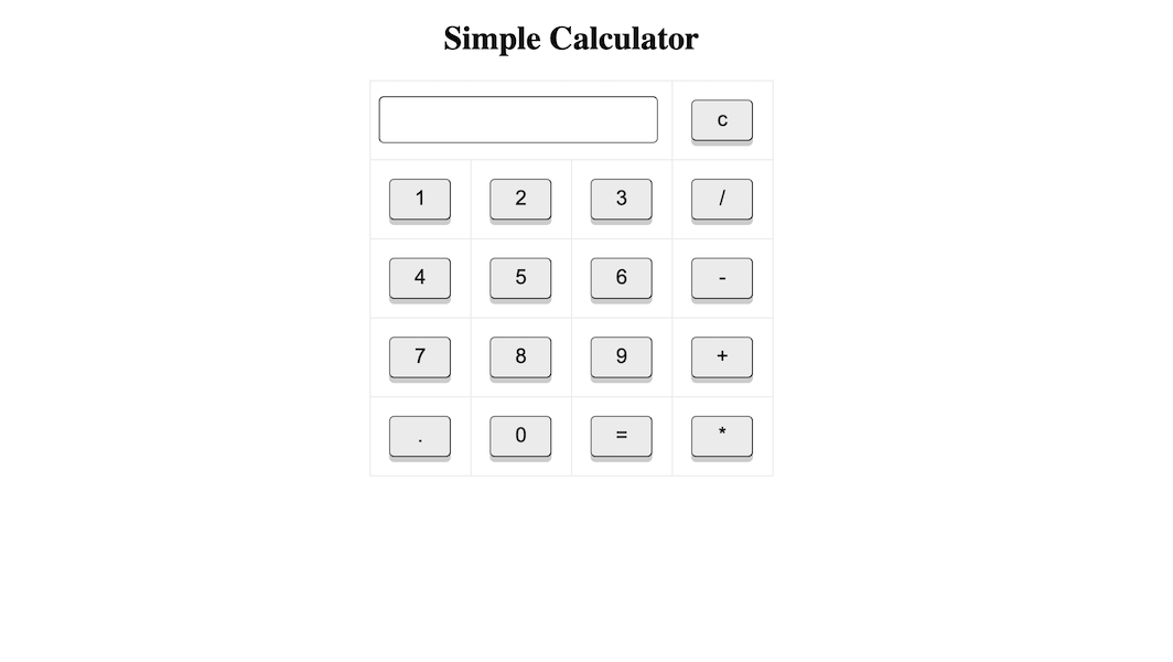
Button font size, box shadow and margin
Update the button CSS as below:
input[type="button"] {
  ...
  height: 40px;
  font-size: 20px;
  box-shadow: 0 5px rgba(0,0,0,0.2);
  margin: 10px;
}
It will update the font size of button, add the shadow effect which kind of give the 3-D effect to button and add margin to button.
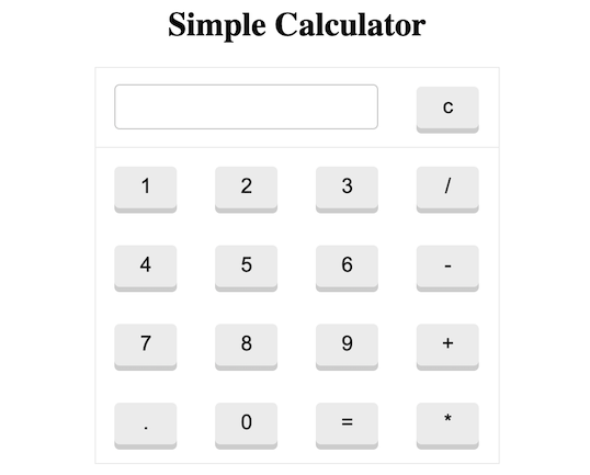
Now, if you see the UI of calculator, it should look like below:
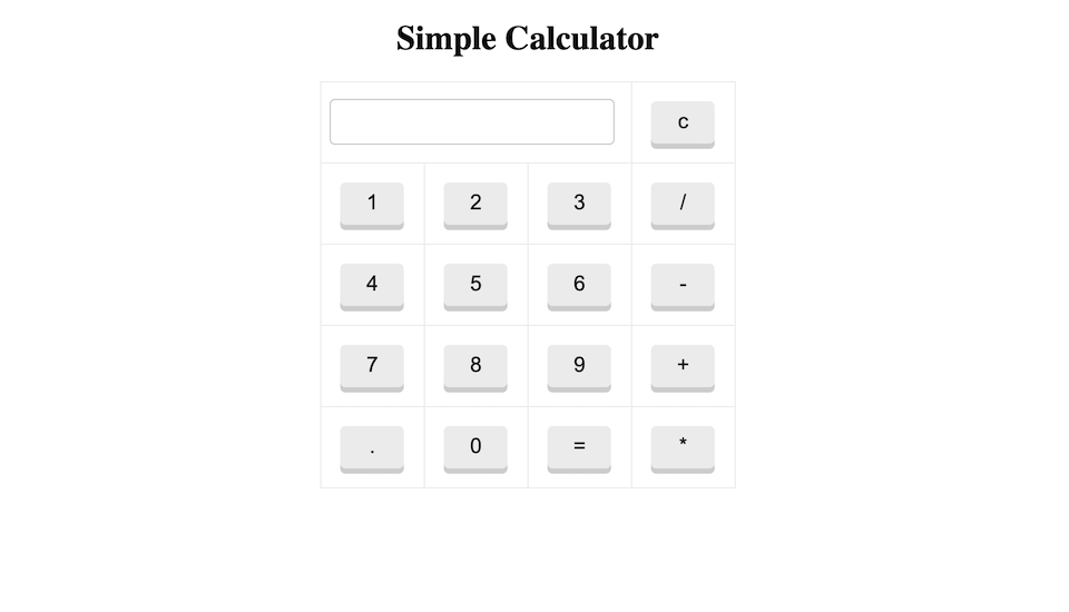
Update border color
Let’s update border color of textbox and button to remove the darkness:
input[type="button"] {
  ...
  margin: 10px;
  border: 1px solid #eee;
}

input[type="text"] {
  ...
  height: 40px;
  border: 1px solid #ccc;
}
Now, UI should look like:
Remove the cell border
Those border like lines around buttons are making whole calculator ugly. Let’s remove it.
Remove the line border: 1px solid #eee; from td, th {. However, if you do that then there is no border and it make the whole calculator kind of free.
Give the border to the table itself which represents the whole calculator:
table {
  margin: auto;
  border-collapse: collapse;
  border-radius: 5px;
  border: 1px solid #eee;
}
One thing which you will notice is the misalignment of textbox with the buttons 1, 4, 7 and ..
Update the textbox CSS as below:
input[type="text"] {
  background-color: white;
  width: 90%;
  border-radius: 5px;
  text-align: right;
  height: 40px;
  border: 1px solid #ccc;
  margin-left: 10px;
}
NOTE: The property width is update to 90% and margin-left is newly added.
The updated UI is:
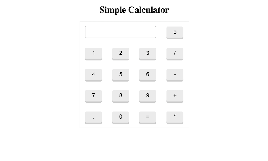
Highlight first row
Since the first row is special as it contains the textbox and button to clear it, a separation of it from rest of the buttons will improve the UI of calculator.
Add the following CSS at the bottom of style.css file to add a simple bottom border to first row.
table tr:first-child {
  border-bottom: 1px solid #eee;
}
Notice the separation below:
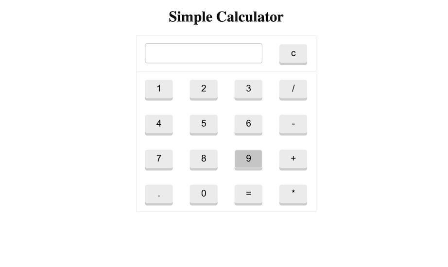
Button hover effect
Lastly, the hover effect to button will boost the whole experience of using the calculator. Add following CSS code below the
input[type="button"] to change the background of buttons to darker color than the existing background color.
input[type="button"] {
 ...
}
input[type="button"]:hover {
  background-color: #ccc;
}
| It is best practice to group together related CSS code. |
Notice below when I hover the button 9, it got highlighted.
Calculator functional changes
Although, we think our calculator is functionally fine, but we have following bugs:
- Right now, if click on button
=then the text box will showundefined - Click on operator buttons update the text box. Ideally it should not since the first must be numeric or decimal (.)
Let’s fix above bugs.
Fixing undefined issue on click on equal to
This can be easily fix by checking if the value of textbox is empty or not. If it is empty then just return from the function solve().
Update the solve function as below:
function solve() {
  let x = document.getElementById("result").value;
  if (x == "") {
    return;
  }
  let y = eval(x);
  document.getElementById("result").value = y;
}
Now, if you click on = operator in the calculator, you will find that the bug has been fixed.
Fix operator buttons issue
To fix it, the solution is quite simple.
Inside displayValue() function, we need to store the initial value of text box which is represented by result id.
let initialVal = document.getElementById("result").value;
Then, now when the initialVal is empty and if we click on any of the operators, then we should do nothing and return from the
function.
if (initialVal == "") {
  if (["+", "-", "*", "/"].indexOf(val) != -1) {
    return;
  }
}
More better would be to store the list of operators as a constant.
const OPERATORS = ["+", "-", "*", "/"];

...

if (initialVal == "") {
  if (OPERATORS.indexOf(val) != -1) {
    return;
  }
}
Source Code
Find the source code of the tutorial here.

Help me to improve BRG Trainings.