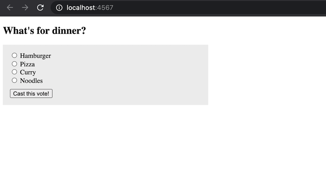
Styling voting page
Styling the list of choices page through CSS
In the previous phase, the list of choices looks bit ugly like there is a dot before every choice. In this phase, we will try to make our choices list page looks beautiful using CSS.
Adding the CSS
Sinatra assumes that you should store all your static files like CSS, JS or images under public folder.
See static files for more details.
| While including the static file in the view files, you don't add 'public' in the path. Hence, if you store your CSS inside 'public/css/style.css' then while linking the CSS inside view file, you just write '/css/style.css' as path. |
Create a folder with name public and then create another folder with name css to store CSS specific files. Then, finally create a CSS file with name style.css. Add following content inside the style.css file to have minimum styling to our existing app.
.container {
  margin: auto;
  max-width: 1100px;
  padding: 0 20px;
}

form {
  background: #eee;
  width: 450px;
  padding: 1rem;
}
ul {
  list-style: none;
  margin: 0;
  padding: 0;
}
button {
  margin-top: 10px;
}


Help me to improve BRG Trainings.